Responsive Templates
Tips on creating mobile-ready slscart templates. The template designer should be familiar with HTML5 and CSS (cascading style sheets). Note that slscart uses responsive templates, which have the advantage that mobile and desktop use the same database and code. They respond to any size (screen) device.
The following list has several suggestions for creating a template; responsive or otherwise.
- Template include codes, or tics,are an integral part of a template. They begin and end with percent signs, like %BRAND%. Wherever a valid tic appears it will be substituted with the appropriate code when a web page is viewed.
- The template's doctype, the first line in the template, should be for HTML5 (<!DOCTYPE html>)
- CSS should appear before javascript, when possible, for performance reasons. If you want to override CSS that is provided by slscart (via %STYLE_SHEET%) then it would appear after %STYLE_SHEET%. Note that %STYLE_SHEET% generates CSS and javascript.
- Any images specifed (<img> tag) should have, at the minimum, attributes src, width, height, and alt filled out
- Put full paths to images in the template. If not, they will break when using custom pages. I use %SITE_URL% to prefix image paths
- If using %STYLE_SHEET%, which is highly recommended, the following
defaults are used
- For images, the border is set to 0 (i.e. no border around an image. No border="0" attribute necessary for <img>)
- A 20px gap is between the top of the screen and the top of the header
- Since search engines are rating sites on how fast they load, the smaller (i.e. filesize, or how much space on the computer it takes up) the image the better. We have found the site tinypng.com most helpful. One can drag and drop an image on the site and it will do its best to shrink the filesize of the image. We have seen, many times, a shrinkage of 70% or more.
- In the examples to follow, note the order of %META_TAGS%, %TITLE_TAG%, and %STYLE_SHEET%.
- Took out type="text/css" from <style> as it is not necessary for html5
- <script> needs no additions, like language="javascript" for html5, as long as the script is javascript
Template Examples
Several templates that come with slscart are explained in detail.
Menu
For a vertical menu to slide from left use %MOBILE% which creates a horz mobile menu and %PAGES_VERTICAL% which shows the created pages
Catalog Images
Under storeadmin > Web Site > Images > Catalog Images > Update
Use %SITE_LOGO%, the Logo shows up on a desktop pc whereas the Mobile Logo shows up when the device width < max width (800px?)
Fonts
Some fonts do not reside on a mobile phone, just the desktop. A good mobile phone font is Open Sans or Droid Sans which was designed specifically for mobile phones and readability. Android uses Roboto as its default.
Create a mobile.css file. An example one is shown below. There are three sections: all, desktop, and mobile. 'all' elements affect desktop and mobile. 'desktop' only affects desktop pcs (ones with a screen width larger than 640px). Mobile affects only mobile devices (screen width 640px or less).
I use a version number in the mobile css file, e.g. mobile_1.0.0.css so sites will get immediate benefit from mobile css changes, rather than waiting for their browser's cache to update. Note, the template's mobile css needs to be updated, too.
1. The biggest change is the size of the banner. Note there are two banners, one for desktop and one for mobile.
2. Another change is large fixed width columns. These can be changed to percentages or specified differently under 'desktop' and 'mobile'.
3. It is best to use <div> instead of <table> to create columns, etc.
4. Viewport needs to be configured. One is created if %META_TAGS% is used. The meta tag viewport controls how mobile devices view a web page. This is added in the website's template. The one shown below should suffice for most cases. More can be found here:
https://developers.google.com/speed/docs/insights/ConfigureViewport
<!DOCTYPE html>
<html lang="en-us">

<head>
<title>%TITLE_TAG%</title>
%META_TAGS%
<meta name="viewport" content="width=device-width, initial-scale=1">
* Template needs to use HTML5 doctype (which is <!DOCTYPE html>) It is case insensitive.
* Note the mobile css file is specified after %STYLESHEET%. This is so mobile css can override any css in the main stylesheet.
mobile.css sample
/*** all ***/
body {
bgcolor: #FFFFFF
}
.width100 {
width: 100%;
}
.centerblk {
display:block;
margin-left:auto;
margin-right:auto
}
.cpfont {
font-family: Georgia, serif;
}
    .bs2 {
    text-indent: 0px;
    margin: 0
    }
    .bs3 {
    text-indent: 0px;
    padding: 0;
    margin: 50px 0px 0px 0px;
    }

/*** desktop ***/
@media screen and (min-width: 641px) {
    /* banner */
    #header {
    background: url("http://www.boho-mama.com/images/Banner1.png") center no-repeat;
    height: 300px;
    }
    .bsss {
    margin-left: 300px;
    margin-right: 275px;
    }
    .bs2 {
    padding: 0px 0px 0px 300px;
    }
}

/*** mobile ***/
@media screen and (max-width: 640px) {
    /* banner */
    #header {
    background:url("//www.slstesting.com/testinst/images/banner1-2.png") no-repeat center;
    height: 183px; /* height of image */
    }
    .bs2 {
    padding: 0;
    }
}
The header would be defined as:
<div id="header></div>
or
<header></header>
and replace #header with header in the mobile.css
Helpful CSS
Min & Max Width
Max-width property allows you to set the max width of the element. The purpose of max-width is to prevent the element from extending the boundary.
Max-Width Container
In the example below, I specify the container to display at 800px if possible, but it should not exceed 90% of the boundary width.
.container {
	width: 800px;
	max-width: 90%;
}
Responsive Image
You can make the image auto resize to the max width of the boundary by using max-width:100% and height:auto.
img {
	max-width: 100%;
	height: auto;
}
The above responsive image CSS works on IE7 and IE9, but doesn't work on IE8. To fix it, add width:auto. You may apply a conditional CSS specifically for IE8 or use the IE hack below:
@media \0screen {
  img {
  	width: auto; /* for ie 8 */
  }
}
Min-Width
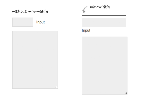
Min-width is opposite to max-width. It sets the minimum width of an element. In the example form below, min-width is used on the input text field to prevent the input from getting very small when scaling down.
3. Relative Values
In responsive design, knowing when to use relative value can simplify the CSS and maximize the best layout result. Below are some examples.
Relative Margin
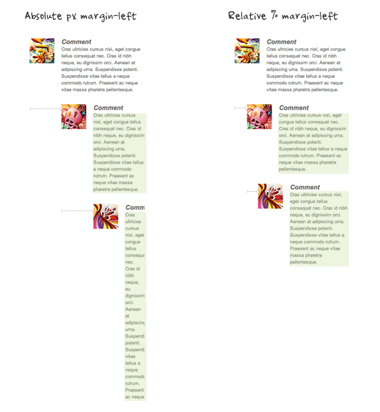
Below is an example of a commentlist where relative left margin is used to space out the threaded comments. Instead of using fixed pixel value, I used percentage value to space out the sub-lists. As shown on the left side of the screenshot, the content box in the sub-lists gets very small on mobile resolution if pixel left margin was used.
Relative Font Size
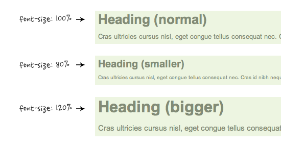
With relative value (eg. em or %), the font size, line-height and margin spacing can be inherited. For example, I can change the font size on all descendant elements by simply changing the font-size on the parent element.
Relative Padding
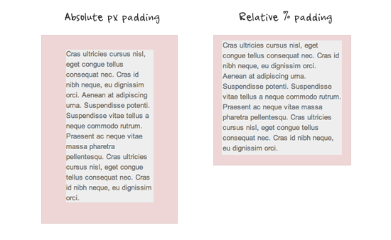
The screenshot below shows it is better to use relative percentage padding as opposed to fixed pixel padding. The box on the left shows an unbalanced padding space if pixel padding was used. The box with percentage padding on the right shows that the content area is maximized.
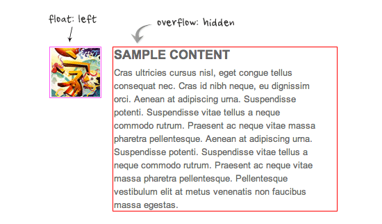
4. Overflow:hidden Trick (demo)
As posted in my previous article, you can clear float with the overflow property. This trick is extremely useful. You can clear the float from the previous element and keep the content running within the container by applying overflow:hidden.
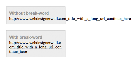
5. Word-break
You can force unbreaking text (eg. long URL text) to wrap instead of running in a single line.
.break-word {
    word-wrap: break-word;
}
***